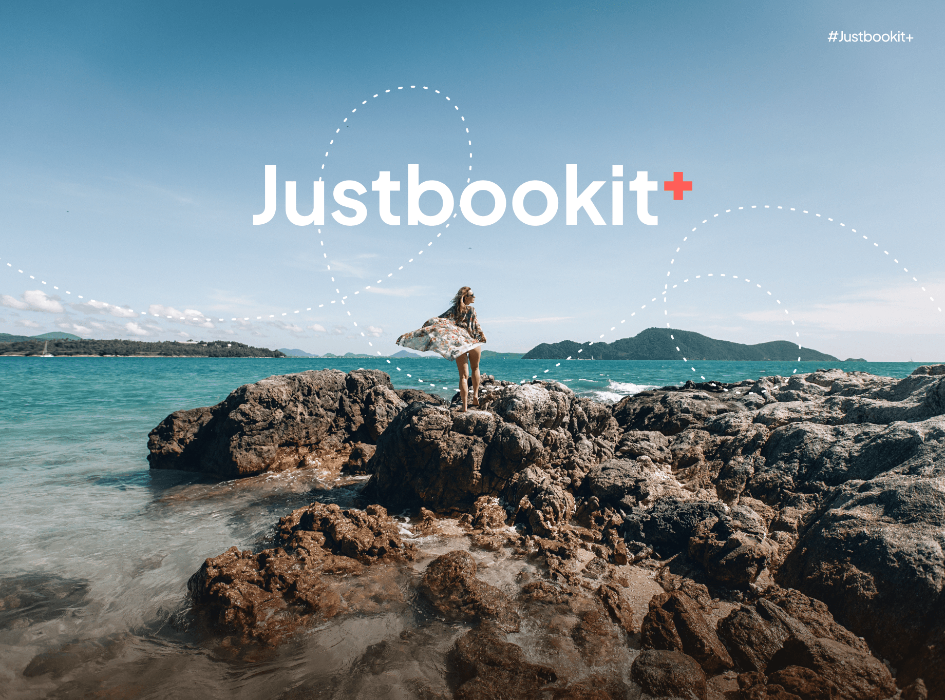
Justbookit+ is a bold travel ecosystem built for explorers—not tourists.
It goes beyond bookings to craft immersive journeys, spark connection, and inspire purposeful travel.
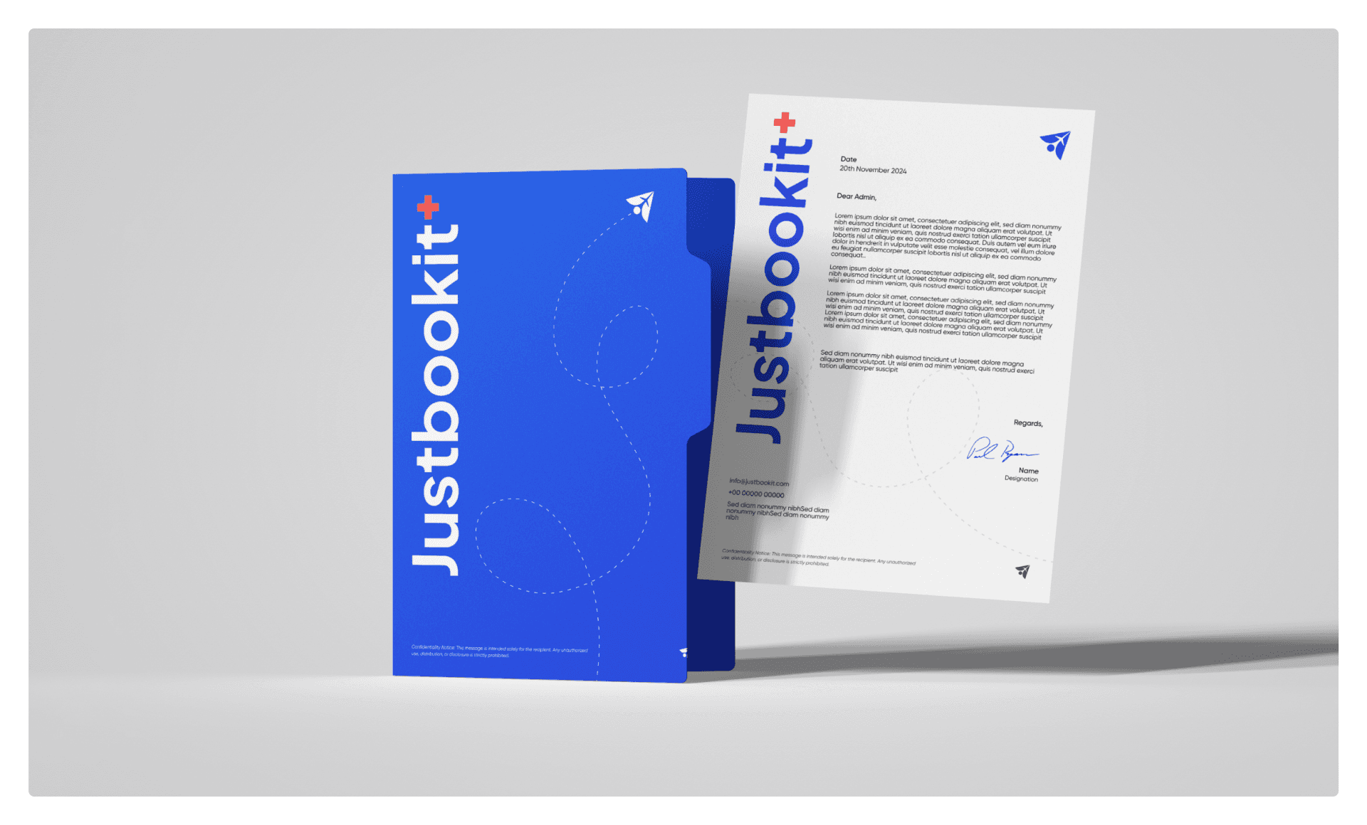
Just Book It+
Just Book It+
Black*C
Strategy, Branding, UX Design, UI Design, Website, Web Application
Industry:
Travel
Duration:
45 Days
Introduction
The travel industry evolved, but booking platforms didn’t.
Justbookit+ isn’t just another app, it’s a global travel ecosystem.
Built for explorers, not tourists. For journeys, not just tickets.
We don’t sell flights, we craft experiences, spark wanderlust, and unite a tribe of travelers.
With a bold, intelligent platform, we turn movement into meaning.
This isn’t a product. It’s a movement.
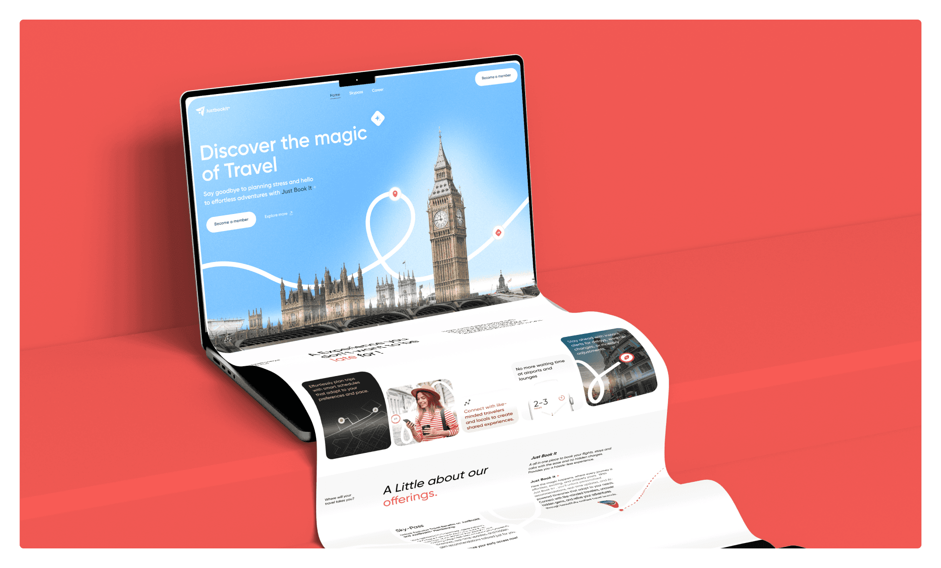
We offer itinerary creation, social discovery, travel content, and personalized deals, all in one intuitive, immersive space.
Justbookit+ is designed to simplify travel planning while inspiring real connection, with people, places, and stories.
From solo backpackers to family adventurers, we bring together a new generation of purposeful travelers.


Most travel apps feel dull. Justbookit+ changes that with a vibrant, psychology-backed palette. Indigo and Cobalt Blue evoke trust and modernity, while Vivid Azure adds digital energy.
Coral Red sparks excitement and drives action, pulling users into the experience. Sky Blue and Light Cyan create calm, clarity, and a sense of freedom.
Each color was chosen not just to look good—but to make travel feel exciting, personal, and deeply emotional.
It’s not just design.
It’s how we make users feel the journey.


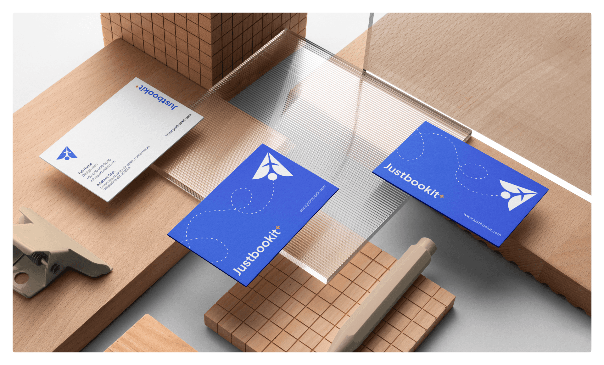
Icon:
A smart fusion of a paper plane and human figure, symbolizing motion, discovery, and connection.
Plus Symbol (+):
Represents added value, limitless travel possibilities, and an all-in-one ecosystem.
Typography:
Set in Plus Jakarta Sans, radiating clarity, modernity, and global friendliness.
Colors:
Cobalt Blue inspires trust; Coral Red injects energy and emotional spark.
Structure:
Minimal yet memorable, designed for instant recognition across digital and physical platforms.
Overall Essence:
The logo embodies intuitive, intelligent, and exciting travel in its purest visual form.

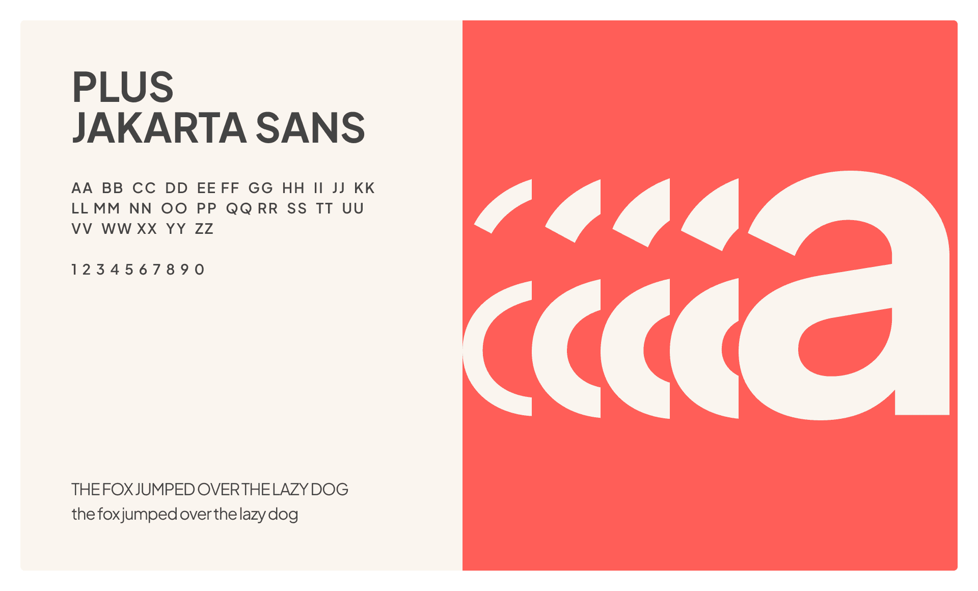
We chose Plus Jakarta Sans for its clean, modern, and highly legible form, perfect for a brand that lives across screens, time zones, & languages. Its geometric structure adds clarity and confidence, while its friendly curves reflect our human-first approach to travel.
From app interfaces to billboards, this typeface ensures every journey feels easy, intuitive, & premium.


Justbookit+ solves the problem of fragmented, soulless travel platforms by becoming a smart, social-first travel ecosystem, one that feels personal, intuitive, and exciting.
With a brand personality that’s witty, helpful, conversational, and driven, we speak the language of today’s traveler, clear, friendly, and full of wanderlust. This tone isn’t an accessory, it’s the core of the experience. It builds trust, creates emotional engagement, and turns booking into a community-led journey.
As a result, we’re not just expecting more users, we’re building loyal explorers, higher retention, and a brand that people want to come back to, again and again.


“For modern travelers, Justbookit+ is the first AI-powered, community-driven travel ecosystem that curates, connects, and elevates every journey beyond just booking.”
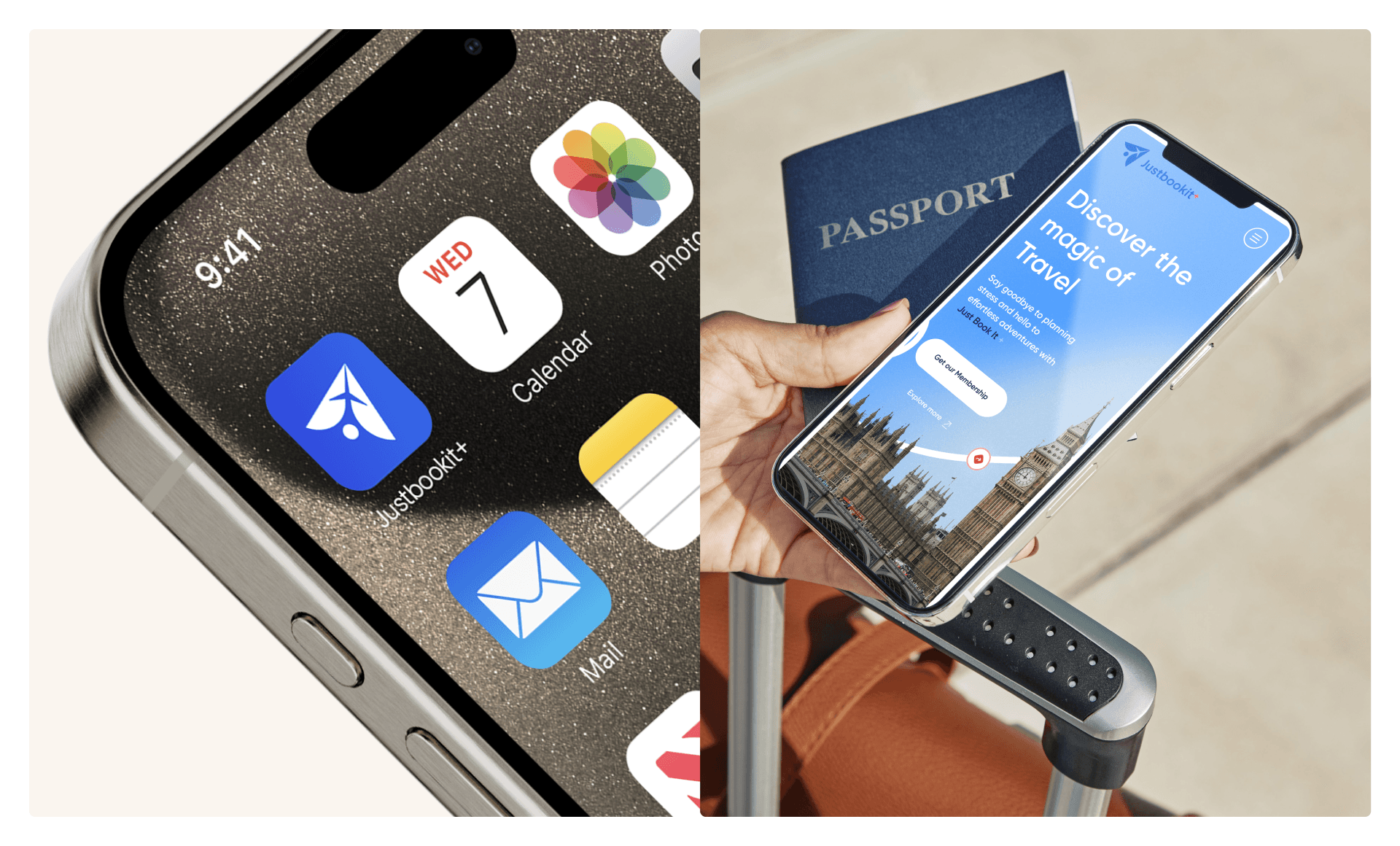
Justbookit+ is a global travel companion that fits on your phone and acts like an agent, local guide, travel buddy, and community all packed in one. When you’re at home and looking for flights it tells you how to get there at the best budget. It also advises you while you plan, in the best way, by making available other peoples experiences. And for more reasons to travel, it gives you offers and deals that are too good to waste.

Client / Justbookit+ ✈️✈️
Project / Art Direction, Branding, Website, Web-Application, Mobile Application.
Black*C 2025© All rights reserved.
Let's create your star with us:
Creative Director - Tanvi Jadhav.
Lead Designers - Khemchnadra Mistari.